
New features
Turnout on your phone: page layouts
A visual tour of the latest phone layouts for home, events, artists, communities, spaces and classes.
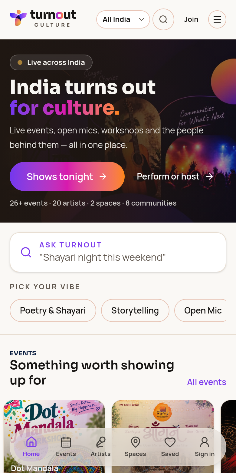
Home — this week across your city →
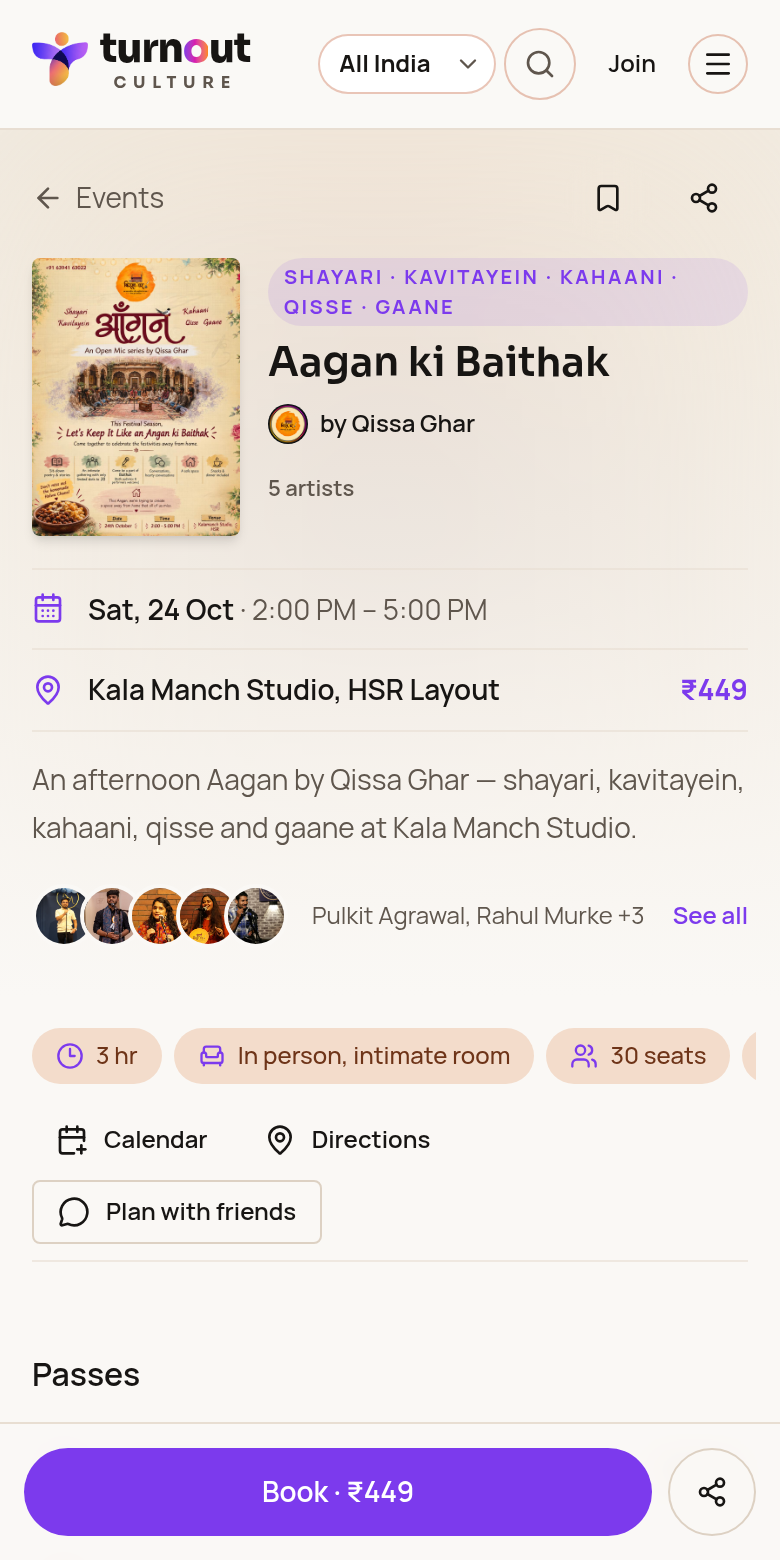
Event — poster, date, place, price and Book button →
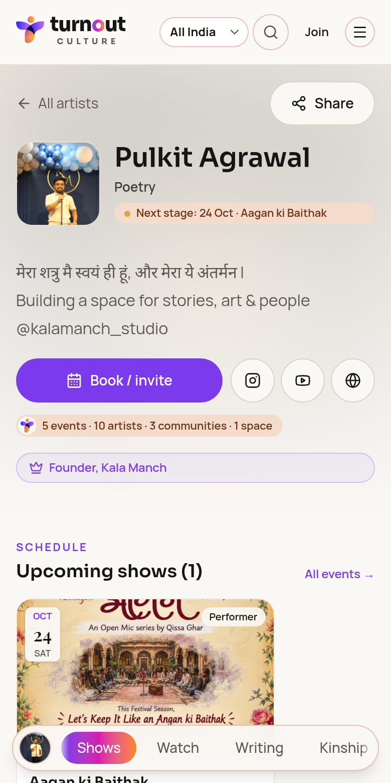
Artist — portrait, Book / invite, shows and tabs →
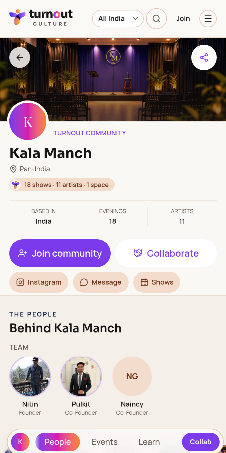
Community — banner, Join, team and Collab →
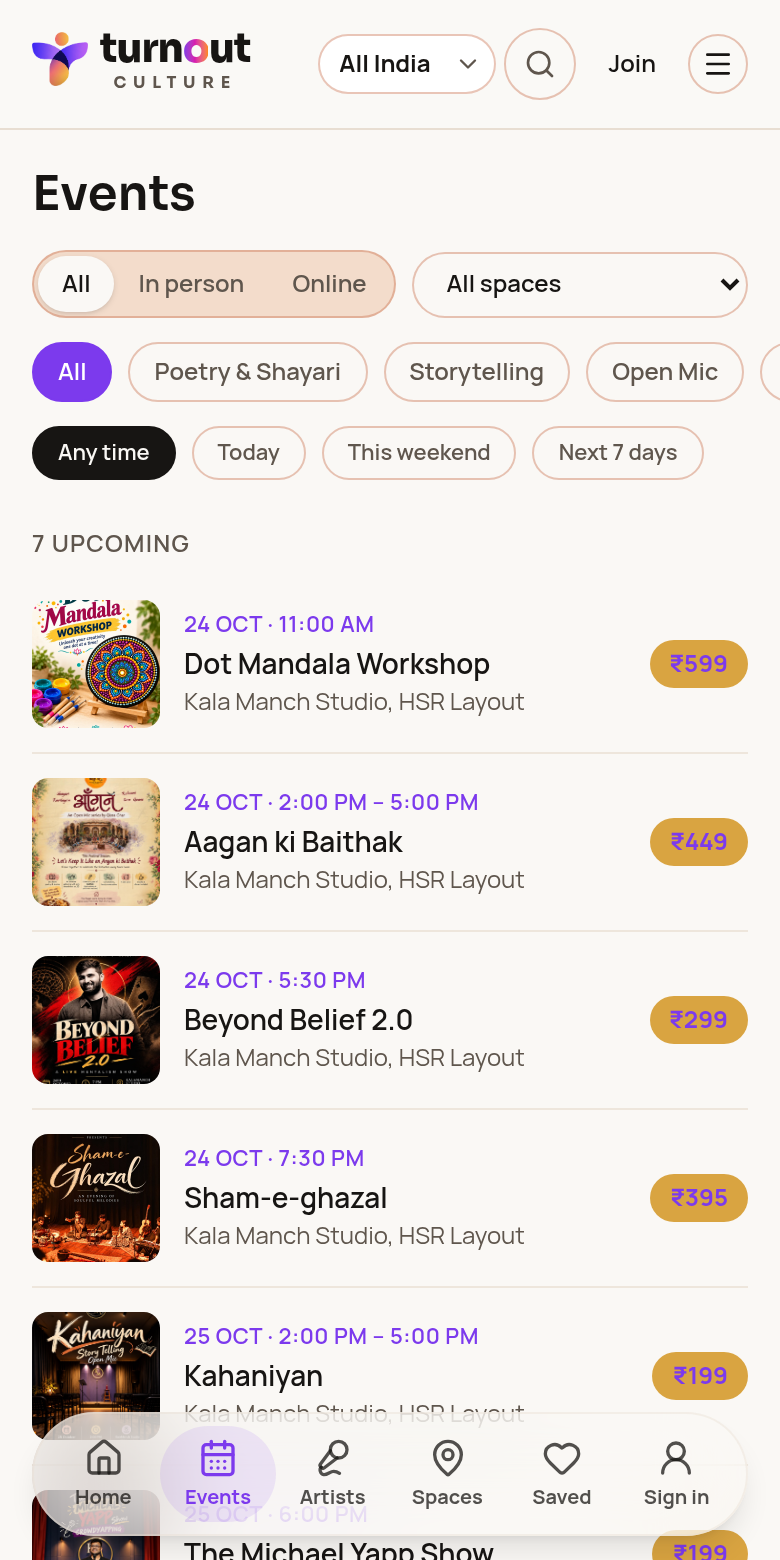
Events listing →
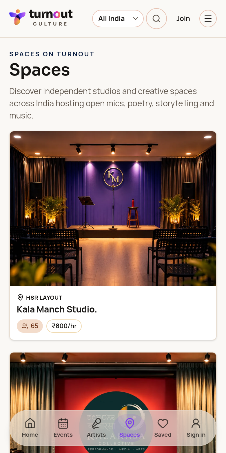
Creative spaces →
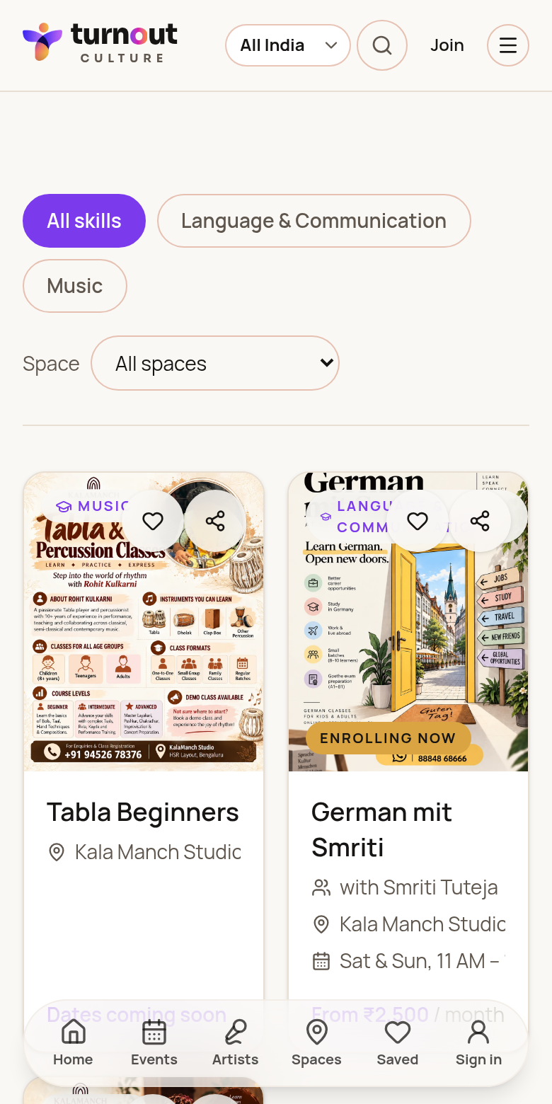
Classes & workshops →
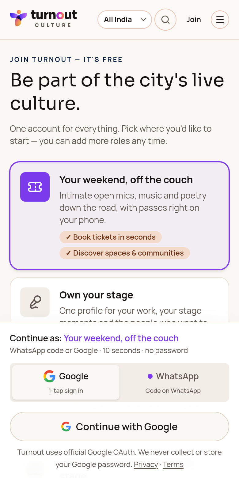
Join Turnout →
Event page
- 1Poster sits beside the title, tags, organiser and artist count.
- 2Date, time, place and starting price are in one short list.
- 3Artist faces show the lineup; tap See all for everyone.
- 4Calendar, Directions and Plan with friends sit under the details.
- 5A fixed Book button with price and Share stays at the bottom.
Artist profile
- 1Smaller portrait beside name, craft and next stage.
- 2Book / invite is the main button; social icons sit next to it.
- 3Verified credits, like Founder, appear as one badge.
- 4Upcoming shows come first, as poster cards.
- 5A floating tab bar jumps between Shows, Watch, Writing and Kinship.
- 6Videos sit in a side-scrolling row and load only when tapped.
Community page
- 1Banner photo with logo, name, city and show counts.
- 2Join community is the single main button; Collaborate sits beside it.
- 3Instagram, Message and Shows are small quick links.
- 4The team appears as round photos with their roles.
- 5A floating tab bar covers People, Events and Learn, with a Collab shortcut.
Listings, spaces and classes
Events, spaces, artists, communities and classes use the same cards on phones, with clear posters, dates and prices. The bottom bar takes you home, to search, saved items and your account.
Pictures were taken at a 390-pixel-wide phone screen. Your listings show your own photos and events.
Was this guide helpful?